Expand/Collapse Panel
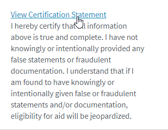
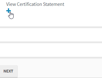
You can use the Expand/Collapse Panel component to add an interactive control to a form that allows the user to expand or collapse content. You can style the control as a text link or as a plus/minus button that is center, left, or right aligned. Custom styling is also supported. You specify the expanded/collapsed content in the HTML property.
Properties
Control Property Settings
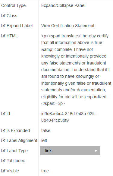
Rendered Component
Label Type = link
Label Type = plus/minus
-
Class is an optional CSS class (or space separated classes) added to the top level of the control. CSS specific to the control can be applied. The class must be defined in a Renderer CSS file. For more information, see Custom Styles.
-
Expand Label is the value displayed in the label for the clickable expand.
-
If this value is bound, it must be enclosed in double braces, e.g., {{vm.models.myLabel}}.
-
Allowable suffix characters: starts with letter, then letters, numerals, or underscore.
-
-
The HTML property enables you to format rendered output using a subset of standard HTML markup as a fragment of an HTML page. That is to say, <!DOCTYPE html>, <html>, <head>, <body> and <form> tags are not appropriate in an HTML fragment. While they may not harm the page, they do have the potential to create silent Renderer errors or cause the page rendering to fail completely. The HTML validation parser will point out errors in the HTML fragment and mark them as a warning but will not attempt to enforce rules. Warnings should be corrected to avoid unexpected results.
An example of an HTML fragment is:
<h2 class=”myclass”>Campus View</h2>
<img src="IMG_2671.jpg" alt="Campus View" style="width:304px;height:228px;">
Also possible are <script> and <style> fragments. This allows a great deal of customization. A model value can be addressed in JavaScript with “window.vmModelsRef”. If you had an argument in a workflow “myKey”, which would also be a model value “vm.models.myKey”, then in external HTML JavaScript this can be addressed with “window.vmModelsRef.myKey” or “window.vmModelsRef[‘myKey’]”.
Similarly, parameters for the Renderer URL that are addressed with formInstance.QueryParams.DataDictionary(“myKey”) or special case formInstance.QueryParams.DataDictionary(“addonQueryParams”) in the workflow (see Renderer URL Query Parameter), can be addressed in external HTML JavaScript as “window.vmQueryParamsRef.myKey” or “window.vmQueryParamsRef[‘myKey’]. This would allow you to pass information in the Renderer URL to your custom JavaScript (or even to a custom style via a binding). Of course, depending on how it is to be used, make sure your JavaScript and/or workflow validates the information passed, or this could be a security risk.
-
Id is required. It can be any valid JavaScript id attribute value. (Must start with a letter followed by 0 to 9, a to z, dash, or underscore characters).
-
Using a globally unique identifier (GUID) from GuidGen or GuidGenerator prefixed by at least one letter prevents a clash with any other id.
-
Id should contain only a to z (uppercase or lowercase), 0 to 9, dash, or underscore. It should not have spaces.
-
Binding is not supported for this property.
-
-
Is Expanded sets the control to be collapsed or expanded.
-
Must be true or false, or a binding beginning with "vm.models.".
-
A property array string index requires single quotes, e.g. vm.models.xxx.CustomProperties['yyyyy'].
-
An expression can be used that evaluates to true or false, e.g. vm.models.myvalue==7 (>,<,!=,==,>=,<=).
-
If comparing to a string, it must be in single quotes.
-
(true and false must be all lowercase)
Note: If you want the content of the Expand/Collapse Panel component to be displayed in View Summary and/or PDF, set the “Is Expanded” property to true.
-
-
Label Alignment aligns the label. Select from the drop-down list. The options are center, left, and right.
-
Label Type set a label type. Select from the drop-down list. The options are link and plus/minus.
-
Tab Index allows you to specify the order of elements that are brought into focus when the user presses the Tab key on the rendered form. Allowed values are -1, 0, and positive numbers.
-
A value of "-1" removes the element from the sequential tab order preventing keyboard users from focusing on it.
-
A value of "0" means the element is ignored in the tab order, but that does not mean users cannot tab to and focus an element.
-
A value of "1" sets the element as the first item to gain focus when tabbing through the page followed by any higher numbered tab indices, followed by any other keyboard focusable elements such as buttons. required fields, and CAPTCHA.
The tab index value should not match another control's tab index.
-
A blank value (default) will not add a tab index in the HTML.
For more information, see https://html.spec.whatwg.org/multipage/interaction.html#the-tabindex-attribute and https://www.alexlande.com/articles/cross-browser-tabindex-woes/.
-
-
Visible makes the control visible or hidden.
-
Can be bound to a workflow argument or another control's value. This property is dynamic.
-
A property array string index requires single quotes, e.g., vm.models.xxx.CustomProperties['yyyyy'].
-
An expression can be used that evaluates to true or false, e.g., vm.models.myvalue==7 (>,<, !=, ==, >=, <=). If comparing to a string, it must be in single quotes.
-
(true and false must be all lowercase)
-