Popup
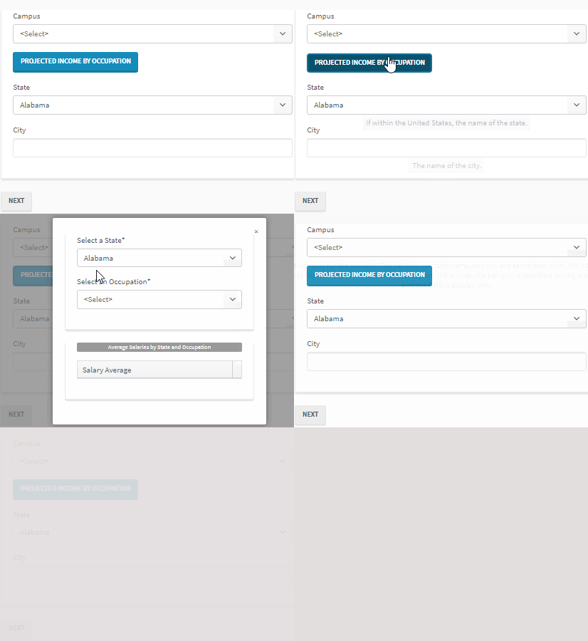
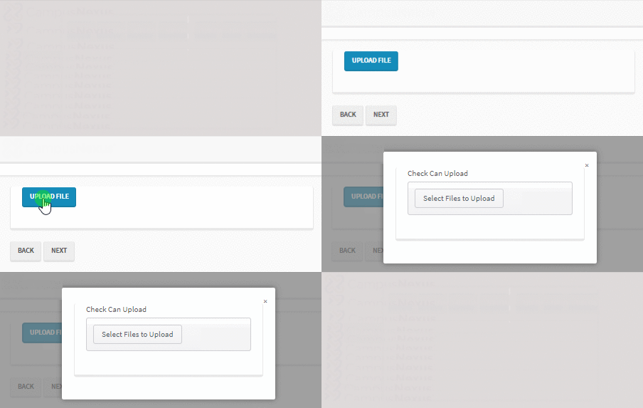
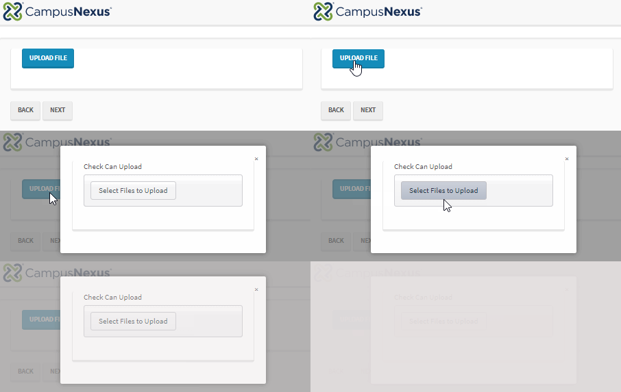
You can use the Popup component to add a modal popup window to a form. The user clicks a button to open the popup. While the popup is open, a semi-transparent background hides the rest of the page so that the user cannot interact with the page until the popup is closed. The user can click the background or the ![]() button in the upper right corner of the popup to exit the popup.
button in the upper right corner of the popup to exit the popup.
You can design the layout of the popup using Fields, a subset of the Components, and Form Sections in the same manner as you would design the layout of any other form. Custom styling is also supported.
When you click the Edit button in the property settings of a popup, you can insert the following components into the popup:
-
Calendar/Scheduler
-
Checkbox
-
Date Picker
-
Date Time Picker
-
Drop-down List
-
Expand/Collapse Panel
-
File Upload
-
Grid
-
HTML
-
Hyperlink
-
Label
-
Masked Text Box
-
Multiselect
-
Numeric Text Box
-
Radio Button
-
Text Box
-
Textarea
-
Time Picker
-
Typeahead
Notes
-
Required fields are supported in popups. If required fields are included in a form and/or within popups, users will not be allowed to navigate further unless values are provided in all required fields.
-
The contents of a Popup is not displayed in PDF and View Summary, only the popup button is shown.
-
On mobile devices, rendering of Popup components has some limitations. For example, the Grid and Calendar components will not be displayed, other components will be reduced in size.
Properties
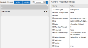
Popup with File Upload component
-
Button Class is the CSS class for the button. The default is
btn btn-primary.-
The class
btn btn-primaryis a Bootstrap class that renders as a blue button with white text. -
You can customize the CSS Class by selecting a different Bootstrap class or adding your own class in a custom CSS.
-
-
Class is an optional CSS class (or space separated classes) added to the top level of the control. CSS specific to the control can be applied. The class must be defined in a Renderer CSS file. For more information, see Custom Styles.
-
Display Text is the label of a button.
-
If this value is bound, it must be enclosed in double braces, e.g., {{vm.models.myLabel}}.
-
Allowable suffix characters: starts with letter, then letters, numerals, or underscore.
-
-
Id is required. It can be any valid JavaScript id attribute value. (Must start with a letter followed by 0 to 9, a to z, dash, or underscore characters).
-
Using a globally unique identifier (GUID) from GuidGen or GuidGenerator prefixed by at least one letter prevents a clash with any other id.
-
Id should contain only a to z (uppercase or lowercase), 0 to 9, dash, or underscore. It should not have spaces.
-
Binding is not supported for this property.
-
-
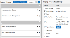
Popup Layout — Click the Edit button to access the layout pane for the Popup. The Popup layout pane uses the same space as the Form layout pane but provides separate Save and Cancel buttons while disabling the Forms tools bar.
The example rendered above has the following layout.
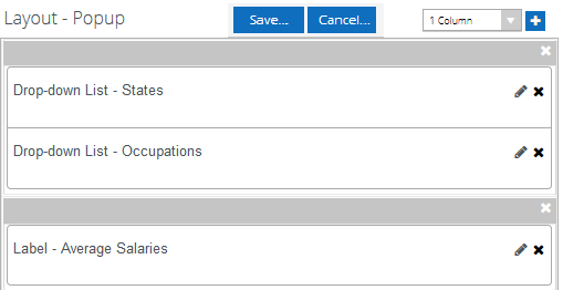
Design the layout of the Popup using Fields, a subset of the Components, and Form Sections in the same manner as you would design the layout of any other form.
Click the Save or Cancel above the Popup layout pane and then save the Form that contains the Popup.
-
Tab Index allows you to specify the order of elements that are brought into focus when the user presses the Tab key on the rendered form. Allowed values are -1, 0, and positive numbers.
-
A value of "-1" removes the element from the sequential tab order preventing keyboard users from focusing on it.
-
A value of "0" means the element is ignored in the tab order, but that does not mean users cannot tab to and focus an element.
-
A value of "1" sets the element as the first item to gain focus when tabbing through the page followed by any higher numbered tab indices, followed by any other keyboard focusable elements such as buttons. required fields, and CAPTCHA.
The tab index value should not match another control's tab index.
-
A blank value (default) will not add a tab index in the HTML.
For more information, see https://html.spec.whatwg.org/multipage/interaction.html#the-tabindex-attribute and https://www.alexlande.com/articles/cross-browser-tabindex-woes/.
-
-
Visible makes the control visible or hidden.
-
Can be bound to a workflow argument or another control's value. This property is dynamic.
-
A property array string index requires single quotes, e.g., vm.models.xxx.CustomProperties['yyyyy'].
-
An expression can be used that evaluates to true or false, e.g., vm.models.myvalue==7 (>,<, !=, ==, >=, <=). If comparing to a string, it must be in single quotes.
-
(true and false must be all lowercase)
-
-
Width specifies the width of the popup. If not set, it defaults to a width defined by the popup.
-
Numeric values are treated as pixels.
-
Binding is not supported for this property.
-
You can use the Popup component to add a modal popup window to a form. The user clicks a button to open the popup. While the popup is open, a semi-transparent background hides the rest of the page so that the user cannot interact with the page until the popup is closed. The user can click the background or the ![]() button in the upper right corner of the popup to exit the popup.
button in the upper right corner of the popup to exit the popup.
You can design the layout of the popup using Fields, a subset of the Components, and Form Sections in the same manner as you would design the layout of any other form. Custom styling is also supported.
When you click the Edit button in the property settings of a Popup, the Components tab shows the subset of components that are available for use in a popup.
Notes
-
Popup components should not contain any required fields. At this time client-side validations are not supported in a Popup.
-
The contents of a Popup is not displayed in PDF and View Summary, only the popup button is shown.
-
On mobile devices, rendering of Popup components has some limitations. For example, the Grid and Calendar components will not be displayed, other components will be reduced in size.
Properties
Popup with File Upload component
-
Button Class is the CSS class for the button. The default is
btn btn-primary.-
The class
btn btn-primaryis a Bootstrap class that renders as a blue button with white text. -
You can customize the CSS Class by selecting a different Bootstrap class or adding your own class in a custom CSS.
-
-
Class is an optional CSS class (or space separated classes) added to the top level of the control. CSS specific to the control can be applied. The class must be defined in a Renderer CSS file. For more information, see Custom Styles.
-
Display Text is the label of a button.
-
If this value is bound, it must be enclosed in double braces, e.g., {{vm.models.myLabel}}.
-
Allowable suffix characters: starts with letter, then letters, numerals, or underscore.
-
-
Id is required. It can be any valid JavaScript id attribute value. (Must start with a letter followed by 0 to 9, a to z, dash, or underscore characters).
-
Using a globally unique identifier (GUID) from GuidGen or GuidGenerator prefixed by at least one letter prevents a clash with any other id.
-
Id should contain only a to z (uppercase or lowercase), 0 to 9, dash, or underscore. It should not have spaces.
-
Binding is not supported for this property.
-
-
Popup Layout — Click the Edit button to access the layout pane for the Popup. The Popup layout pane uses the same space as the Form layout pane but provides separate Save and Cancel buttons while disabling the Forms tools bar.
The example rendered above has the following layout.

Design the layout of the Popup using Fields, a subset of the Components, and Form Sections in the same manner as you would design the layout of any other form.
Click the Save or Cancel above the Popup layout pane and then save the Form that contains the Popup.
-
Tab Index allows you to specify the order of elements that are brought into focus when the user presses the Tab key on the rendered form. Allowed values are -1, 0, and positive numbers.
-
A value of "-1" removes the element from the sequential tab order preventing keyboard users from focusing on it.
-
A value of "0" means the element is ignored in the tab order, but that does not mean users cannot tab to and focus an element.
-
A value of "1" sets the element as the first item to gain focus when tabbing through the page followed by any higher numbered tab indices, followed by any other keyboard focusable elements such as buttons. required fields, and CAPTCHA.
The tab index value should not match another control's tab index.
-
A blank value (default) will not add a tab index in the HTML.
For more information, see https://html.spec.whatwg.org/multipage/interaction.html#the-tabindex-attribute and https://www.alexlande.com/articles/cross-browser-tabindex-woes/.
-
-
Visible makes the control visible or hidden.
-
Can be bound to a workflow argument or another control's value. This property is dynamic.
-
A property array string index requires single quotes, e.g., vm.models.xxx.CustomProperties['yyyyy'].
-
An expression can be used that evaluates to true or false, e.g., vm.models.myvalue==7 (>,<, !=, ==, >=, <=). If comparing to a string, it must be in single quotes.
-
(true and false must be all lowercase)
-
-
Width specifies the width of the popup. If not set, it defaults to a width defined by the popup.
-
Numeric values are treated as pixels.
-
Binding is not supported for this property.
-
