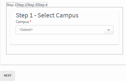
TabStrip
The TabStrip component enables you to place a container of tabs on a form or form section. Each tab represents an existing form.
|
If you delete a form that is contained in a tab, the form will still be rendered, but attempts to export the sequence will fail. The export error message will indicate the name of the missing form. If you update a form that is contained in a tab, the tab version will not get the update until the form with the tab reference is also re-saved. |
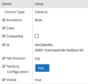
Properties
Control Property Settings
Rendered Component
-
Animation - This value must be false or a valid JSON specification (true is not valid).
Example
{
  "open": {
    "effects": "fade:in",
    "duration": 750
  },
  "close": {
    "effects": "fade:out",
    "duration": 1000
  }
}
The Animation property is not used when the Position is left or right.
-
Class is an optional CSS class (or space separated classes) added to the top level of the control. CSS specific to the control can be applied. The class must be defined in a Renderer CSS file. For more information, see Custom Styles.
-
Collapsible indicates whether the tab contents can be toggled between visible (expanded) and non-visible (collapsed). The default is collapsed when selected. This property is not bindable.
-
Id is required. It can be any valid JavaScript id attribute value. (Must start with a letter followed by 0 to 9, a to z, dash, or underscore characters).
-
Using a globally unique identifier (GUID) from GuidGen or GuidGenerator prefixed by at least one letter prevents a clash with any other id.
-
Id should contain only a to z (uppercase or lowercase), 0 to 9, dash, or underscore. It should not have spaces.
-
Binding is not supported for this property.
-
-
Tab Position is the relative position of the tabs with respect to the content. Select a value from the drop-down list. The options are:
- bottom
- left
- right
- top
The property is not bindable.
-
TabStrip Configuration - Click the Edit button to select the forms to display in the TabStrip and to assign the tab labels. See Creating a TabStrip.
-
Visible makes the control visible or hidden.
-
Can be bound to a workflow argument or another control's value. This property is dynamic.
-
A property array string index requires single quotes, e.g., vm.models.xxx.CustomProperties['yyyyy'].
-
An expression can be used that evaluates to true or false, e.g., vm.models.myvalue==7 (>,<, !=, ==, >=, <=). If comparing to a string, it must be in single quotes.
-
(true and false must be all lowercase)
-
Creating a TabStrip
-
Drag the TabStrip component into the Layout pane.
-
Click the Edit button in the Control Property Settings pane. The TabStrip Configuration window is displayed.
-
In the Existing Forms section, select a form and click the right arrow to move the form to the Tabs pane.
-
In the Tab Label field, specify a label for the tab.

-
Repeat steps 3 and 4 for any additional tabs.
-
To reorder tabs, select a form in the Tabs pane and click the up/down arrows.
-
To remove a form, select the form in the Tabs pane and click the left arrow.
-
-
After you have completed the tab configuration, click Save. The TabStrip Configuration window is closed.
-
Specify additional settings for the TabStrip in the Control Property Settings pane.
-
Save the form or form section.