Text Box
You can use the Text Box component to capture a single line of information. The input type for the Text Box component is defined by the Type property. You can choose from the following Type values: text (default), number, password, email, and url. The available properties depend on the Type:
-
For text, you can specify the Min and Max Length values.
-
For number, you can specify a minimum and maximum value.
-
Type password allows input to be hidden with “*”.
-
Type email and url have built in validations for proper format.
Properties
Example: Type = text
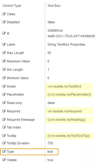
This example shows how you can dynamically bind the Text Box component itself (Model = vm.models.myTextBind) and several other fields: PlaceHolder, Required, RequiredMessage, and Tooltip.
Control Property Settings
Rendered Component

Workflow Arguments
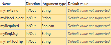
For workflow arguments used with the Text Box in Forms Builder 3.5 and later, see Default Argument Types for Components.
Example: Type = Number
Control Property Settings
Rendered Component

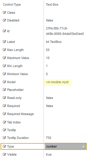
Note: The Text Box for Type=number is rendered with a selector that increments or decrements the typed number within the range of the Max Number and Min Number values. For example, if Max Number=10 and Min Number=0, the increments are 1, 2, 3, ...10.
Workflow Argument

-
Class is an optional CSS class (or space separated classes) added to the top level of the control. CSS specific to the control can be applied. The class must be defined in a Renderer CSS file. For more information, see Custom Styles.
-
Disabled sets a control to disabled.
-
Must be true or false, or a binding beginning with "vm.models.".
-
A property array string index requires single quotes, e.g., vm.models.xxx.CustomProperties['yyyyy'].
-
An expression can be used that evaluates to true or false, e.g., vm.models.myvalue==7 (>,<, !=, ==, >=, <=).
-
If comparing to a string, it must be in single quotes.
- (true and false must be all lowercase)
-
-
Id is required. It can be any valid JavaScript id attribute value. (Must start with a letter followed by 0 to 9, a to z, dash, or underscore characters).
-
Using a globally unique identifier (GUID) from GuidGen or GuidGenerator prefixed by at least one letter prevents a clash with any other id.
-
Id should contain only a to z (uppercase or lowercase), 0 to 9, dash, or underscore. It should not have spaces.
-
Binding is not supported for this property.
-
-
Label is the value displayed in the label.
-
If this value is bound, it must be enclosed in double braces, e.g., {{vm.models.myLabel}}.
-
Allowable suffix characters: starts with letter, then letters, numerals, or underscore.
-
-
Max Length is the maximum number of characters in a text box.
-
If this value is bound, it must be enclosed in double braces, e.g., {{vm.models.myMessagel}}.
-
Allowable suffix characters: starts with letter, then letters, numerals, or underscore.
-
-
Maximum Value specifies the maximum value for a Text Box with
Type=numberor a Numeric Text Box. Leave blank for no maximum. -
Min Length is the minimum number of characters in a text box.
-
If this value is bound, it must be enclosed in double braces, e.g., {{vm.models.myMessagel}}.
-
Allowable suffix characters: starts with letter, then letters, numerals, or underscore.
-
-
Minimum Value specifies the minimum value for a Text Box with
Type=numberor a Numeric Text Box. Leave blank for no maximum. -
Model is required for binding to a workflow argument or another control. If the Model property is not specified, the component will be displayed on the form, but any values the user enters on the form cannot be captured or used in the workflow.
-
The Model value must always start with "vm.models.", e.g., vm.models.myArgument.
-
This value may initialize the control, and may be updated by the control, and if matched to a workflow argument, is available in the workflow (readable or writable).
-
Ensure your model argument is defined in your workflow for custom components if it is used in the workflow. Otherwise, a workflow argument is not required.
-
The casing of an argument used in the workflow MUST match the "vm.models." suffix casing.
-
If the model addresses CustomProperties or MultiValueCustomProperties, the property identifier string must be enclosed in single quotes, e.g., vm.models.myentity.CustomProperties['mycustomprop']
If an OData query is specified and this binding is specified, it will be overwritten with the value of the OData query results and thus be available read-only in the workflow.
If only "Model Data" is specified and the workflow variable is either not initialized or set to an empty array, this value will be initialized to the "Model Data" value.
Construction of the model in the workflow is done by assigning data from a provider.
-
-
Placeholder is the prompt text displayed in a ghost style in an input box when nothing has been entered.
-
If this property is bound, it must start with {{vm.models. and end with }}.
-
Allowable suffix characters: starts with letter, then letters, numerals, or underscore.
In the Text Box with Type = text example above, the Placeholder property is bound to the workflow through the
myPlaceHolderargument. The syntax for the binding is as follows (note the double curly braces):{{vm.models.myPlaceHolder}}This argument allows the ghost text to be defined in the workflow as shown below using the Assign activity.

-
-
Read-only makes the control read-only. It is set to false by default. If you want the component to be read-only, set the property value to true. It is typically used for an input box.
-
Can be bound to a workflow argument or another control's value.
-
A property array string index requires single quotes, e.g., vm.models.xxx.CustomProperties['yyyyy'].
-
An expression can be used that evaluates to true or false, e.g., vm.models.myvalue==7 (>,<, !=, ==, >=, <=).
-
If comparing to a string, it must be in single quotes.
-
(true and false must be all lowercase)
-
-
Required makes the control required and will raise a validation error on the form. It is set to false by default. If input is required, set the property value to true. The rendered form will display a red asterisk (
 ) next to the component.
-
Can be bound to a workflow argument or another control's value.
-
A property array string index requires single quotes, e.g., vm.models.xxx.CustomProperties['yyyyy'].
-
An expression can be used that evaluates to true or false, e.g., vm.models.myvalue==7 (>,<, !=, ==, >=, <=).
-
If comparing to a string, it must be in single quotes.
-
(true and false must be all lowercase)
In the Text Box (Type = String) example above, the Required property is bound to the workflow through the
myRequiredargument. The syntax for the binding is as follows (note that curly braces are not needed here because 'Required' is a Boolean property):vm.models.myRequired -
-
Required Message is optional. It overrides the default "Required" message.
-
If this value is bound, it must be enclosed in double braces, e.g., {{vm.models.myMessage}}.
-
Allowable suffix characters: starts with letter, then letters, numerals, or underscore.
In the Text Box (Type = String) example above, the Required Message property is bound to the workflow through the
myReqMsgargument. The syntax for the binding is as follows (note the double curly braces):{{vm.models.myReqMsg}} -
-
Tab Index allows you to specify the order of elements that are brought into focus when the user presses the Tab key on the rendered form. Allowed values are -1, 0, and positive numbers.
-
A value of "-1" removes the element from the sequential tab order preventing keyboard users from focusing on it.
-
A value of "0" means the element is ignored in the tab order, but that does not mean users cannot tab to and focus an element.
-
A value of "1" sets the element as the first item to gain focus when tabbing through the page followed by any higher numbered tab indices, followed by any other keyboard focusable elements such as buttons. required fields, and CAPTCHA.
The tab index value should not match another control's tab index.
-
A blank value (default) will not add a tab index in the HTML.
For more information, see https://html.spec.whatwg.org/multipage/interaction.html#the-tabindex-attribute and https://www.alexlande.com/articles/cross-browser-tabindex-woes/.
-
-
Tooltip is the value to display when hovering over the control's label.
Example
Control Property Settings

Rendered Component

The property can be bound to the workflow through an argument, e.g.,
myTextTooltip. The syntax for the binding is as follows (note the double curly braces):{{vm.models.myTextTooltip}}
-
Tooltip Duration is the amount of time in milliseconds a tooltip is displayed (default=750). The value must be greater than 0. If it is set to 0, a form validation error will occur.
-
If this value is bound, it must be enclosed in double braces, e.g., {{vm.models.myToolTip}}.
-
Allowable suffix characters: starts with letter, then letters, numerals, or underscore.
-
-
Type is the input type for the component. Choose from the supported types. The directive for this attribute produces a standard <input> tag. The default for the Type value is set based on the control type (e.g., for the Text Box component, the default is
text). Other Type values can be selected in the Value field:password,email,number,url. -
Visible makes the control visible or hidden.
-
Can be bound to a workflow argument or another control's value. This property is dynamic.
-
A property array string index requires single quotes, e.g., vm.models.xxx.CustomProperties['yyyyy'].
-
An expression can be used that evaluates to true or false, e.g., vm.models.myvalue==7 (>,<, !=, ==, >=, <=). If comparing to a string, it must be in single quotes.
-
(true and false must be all lowercase)
- When the control is not visible (usually based on some condition) and is a required field, the required field validation will not be triggered.
-
You can use the Text Box component to capture a single line of information. The input type for the Text Box component is defined by the Type property. You can choose from the following Type values: text (default), email, password, number, url. The available properties depend on the selected input type.
-
For
text, you can specify the Min and Max Length values. -
For
number, you can specify a minimum and maximum value. -
passwordallows input to be hidden with “*”. -
emailandurlhave built in validations for proper format.
The example for Text Box (Type =Text) below shows how you could dynamically bind the Text Box component itself (Model = vm.models.myTextBind) and several other fields: PlaceHolder, Required, RequiredMessage, and Tooltip.
Example: Text Box Type = Text
Control Property Settings

Rendered Component

Workflow Arguments

For workflow arguments used with the Text Box in Forms Builder 3.5 and later, see Default Argument Types for Components.
Example: Text Box Type = Number
Control Property Settings

Rendered Component

Note: The Text Box for Type=Number is rendered with a selector that increments or decrements the typed number within the range of the Max Number and Min Number values. For example, if Max Number=10 and Min Number=0, the increments are 1, 2, 3, ...10.
Workflow Argument

Properties
-
Class is an optional CSS class (or space separated classes) added to the top level of the control. CSS specific to the control can be applied. The class must be defined in a Renderer CSS file. For more information, see Custom Styles.
-
Disabled sets a control to disabled.
-
Must be true or false, or a binding beginning with "vm.models.".
-
A property array string index requires single quotes, e.g., vm.models.xxx.CustomProperties['yyyyy'].
-
An expression can be used that evaluates to true or false, e.g., vm.models.myvalue==7 (>,<, !=, ==, >=, <=).
-
If comparing to a string, it must be in single quotes.
- (true and false must be all lowercase)
-
-
Id is required. It can be any valid JavaScript id attribute value. (Must start with a letter followed by 0 to 9, a to z, dash, or underscore characters).
-
Using a globally unique identifier (GUID) from GuidGen or GuidGenerator prefixed by at least one letter prevents a clash with any other id.
-
Id should contain only a to z (uppercase or lowercase), 0 to 9, dash, or underscore. It should not have spaces.
-
Binding is not supported for this property.
-
-
Label is the value displayed in the label.
-
If this value is bound, it must be enclosed in double braces, e.g., {{vm.models.myLabel}}.
-
Allowable suffix characters: starts with letter, then letters, numerals, or underscore.
-
-
Max Length is the maximum number of characters in a text box.
-
If this value is bound, it must be enclosed in double braces, e.g., {{vm.models.myMessagel}}.
-
Allowable suffix characters: starts with letter, then letters, numerals, or underscore.
-
-
Maximum Value specifies the maximum value for a Text Box with
Type=numberor a Numeric Text Box. Leave blank for no maximum. -
Min Length is the minimum number of characters in a text box.
-
If this value is bound, it must be enclosed in double braces, e.g., {{vm.models.myMessagel}}.
-
Allowable suffix characters: starts with letter, then letters, numerals, or underscore.
-
-
Minimum Value specifies the minimum value for a Text Box with
Type=numberor a Numeric Text Box. Leave blank for no maximum. -
Model is required for binding to a workflow argument or another control. If the Model property is not specified, the component will be displayed on the form, but any values the user enters on the form cannot be captured or used in the workflow.
-
The Model value must always start with "vm.models.", e.g., vm.models.myArgument.
-
This value may initialize the control, and may be updated by the control, and if matched to a workflow argument, is available in the workflow (readable or writable).
-
Ensure your model argument is defined in your workflow for custom components if it is used in the workflow. Otherwise, a workflow argument is not required.
-
The casing of an argument used in the workflow MUST match the "vm.models." suffix casing.
-
If the model addresses CustomProperties or MultiValueCustomProperties, the property identifier string must be enclosed in single quotes, e.g., vm.models.myentity.CustomProperties['mycustomprop']
If an OData query is specified and this binding is specified, it will be overwritten with the value of the OData query results and thus be available read-only in the workflow.
If only "Model Data" is specified and the workflow variable is either not initialized or set to an empty array, this value will be initialized to the "Model Data" value.
Construction of the model in the workflow is done by assigning data from a provider.
-
-
Placeholder is the prompt text displayed in a ghost style in an input box when nothing has been entered.
-
If this property is bound, it must start with {{vm.models. and end with }}.
-
Allowable suffix characters: starts with letter, then letters, numerals, or underscore.
In the Text Box (Type = String) example above, the Placeholder property is bound to the workflow through the
myPlaceHolderargument. The syntax for the binding is as follows (note the double curly braces):{{vm.models.myPlaceHolder}}This argument allows the ghost text to be defined in the workflow as shown below using the Assign activity.

-
-
Read-only makes the control read-only. It is set to false by default. If you want the component to be read-only, set the property value to true. It is typically used for an input box.
-
Can be bound to a workflow argument or another control's value.
-
A property array string index requires single quotes, e.g., vm.models.xxx.CustomProperties['yyyyy'].
-
An expression can be used that evaluates to true or false, e.g., vm.models.myvalue==7 (>,<, !=, ==, >=, <=).
-
If comparing to a string, it must be in single quotes.
-
(true and false must be all lowercase)
-
-
Required makes the control required and will raise a validation error on the form. It is set to false by default. If input is required, set the property value to true. The rendered form will display a red asterisk (
 ) next to the component.
-
Can be bound to a workflow argument or another control's value.
-
A property array string index requires single quotes, e.g., vm.models.xxx.CustomProperties['yyyyy'].
-
An expression can be used that evaluates to true or false, e.g., vm.models.myvalue==7 (>,<, !=, ==, >=, <=).
-
If comparing to a string, it must be in single quotes.
-
(true and false must be all lowercase)
In the Text Box (Type = String) example above, the Required property is bound to the workflow through the
myRequiredargument. The syntax for the binding is as follows (note that curly braces are not needed here because 'Required' is a Boolean property):vm.models.myRequired -
-
Required Message is optional. It overrides the default "Required" message.
-
If this value is bound, it must be enclosed in double braces, e.g., {{vm.models.myMessage}}.
-
Allowable suffix characters: starts with letter, then letters, numerals, or underscore.
In the Text Box (Type = String) example above, the Required Message property is bound to the workflow through the
myReqMsgargument. The syntax for the binding is as follows (note the double curly braces):{{vm.models.myReqMsg}} -
-
Tab Index allows you to specify the order of elements that are brought into focus when the user presses the Tab key on the rendered form. Allowed values are -1, 0, and positive numbers.
-
A value of "-1" removes the element from the sequential tab order preventing keyboard users from focusing on it.
-
A value of "0" means the element is ignored in the tab order, but that does not mean users cannot tab to and focus an element.
-
A value of "1" sets the element as the first item to gain focus when tabbing through the page followed by any higher numbered tab indices, followed by any other keyboard focusable elements such as buttons. required fields, and CAPTCHA.
The tab index value should not match another control's tab index.
-
A blank value (default) will not add a tab index in the HTML.
For more information, see https://html.spec.whatwg.org/multipage/interaction.html#the-tabindex-attribute and https://www.alexlande.com/articles/cross-browser-tabindex-woes/.
-
-
Tooltip is the value to display when hovering over the control's label.
-
If this value is bound, it must be enclosed in double braces, e.g., {{vm.models.myTooltip}}.
-
Allowable suffix characters: starts with letter, then letters, numerals, or underscore.
In the Text Box (Type = String) example above, the Required property is bound to the workflow through the
myTextTooltipargument. The syntax for the binding is as follows (note the double curly braces):{{vm.models.myTextTooltip}} -
-
Tooltip Duration is the amount of time in milliseconds a tooltip is displayed (default=750). The value must be greater than 0. If it is set to 0, a form validation error will occur.
-
If this value is bound, it must be enclosed in double braces, e.g., {{vm.models.myToolTip}}.
-
Allowable suffix characters: starts with letter, then letters, numerals, or underscore.
-
-
Type is the input type for the component. Choose from the supported types. The directive for this attribute produces a standard <input> tag. The default for the Type value is set based on the control type (e.g., for the Text Box component, the default is
text). Other Type values can be selected in the Value field:password,email,number,url. -
Visible makes the control visible or hidden.
-
Can be bound to a workflow argument or another control's value. This property is dynamic.
-
A property array string index requires single quotes, e.g., vm.models.xxx.CustomProperties['yyyyy'].
-
An expression can be used that evaluates to true or false, e.g., vm.models.myvalue==7 (>,<, !=, ==, >=, <=). If comparing to a string, it must be in single quotes.
-
(true and false must be all lowercase)
-