Accessibility Features in Anthology Reach
Reach is invested in the usability and accessibility of all our products and services. We employ a proactive, multifaceted accessibility strategy that includes a shared accountability model for accessibility grounded in the disability community’s feedback. We leverage an international team of accessibility specialists to mentor product teams in integrating accessibility and inclusivity best practices. In keeping with our strong tradition of leadership around accessibility, our products are generally designed and developed with internationally recognized Web Content Accessibility Guidelines (WCAG) in mind.
Semantic Structure and Navigation
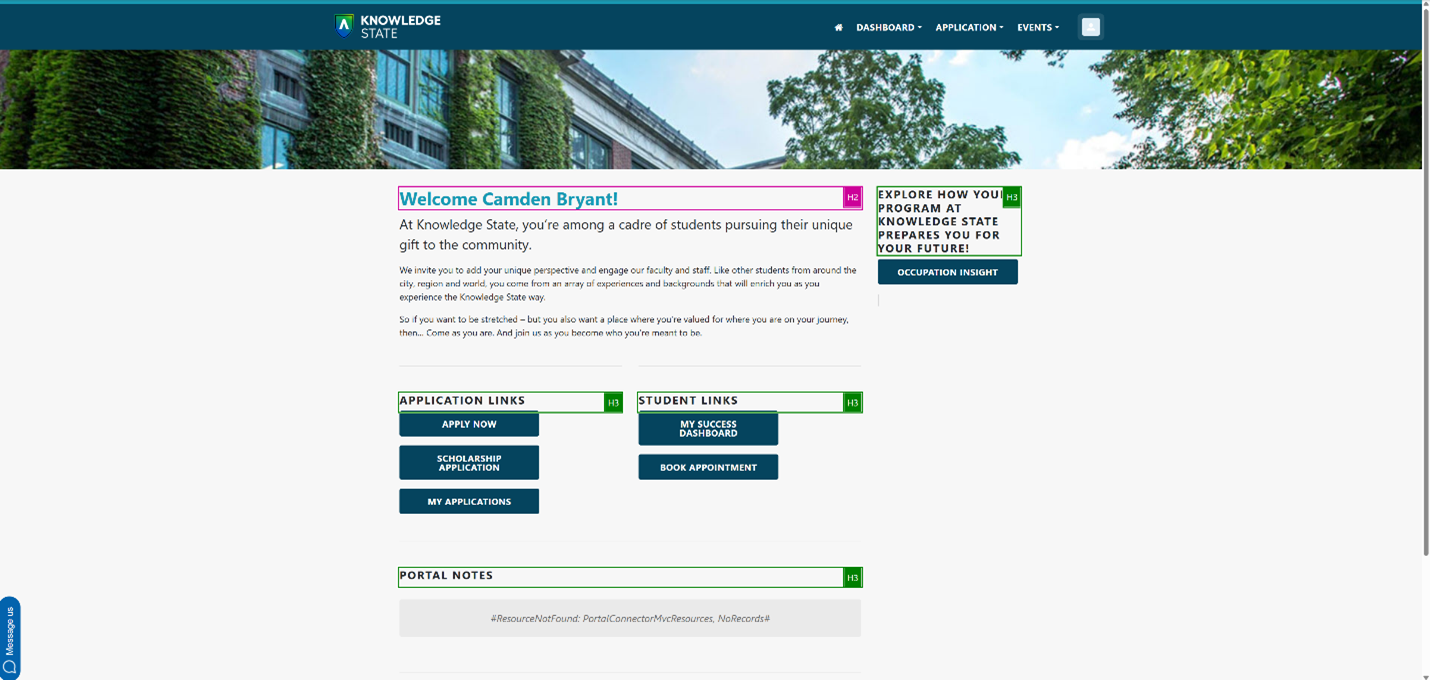
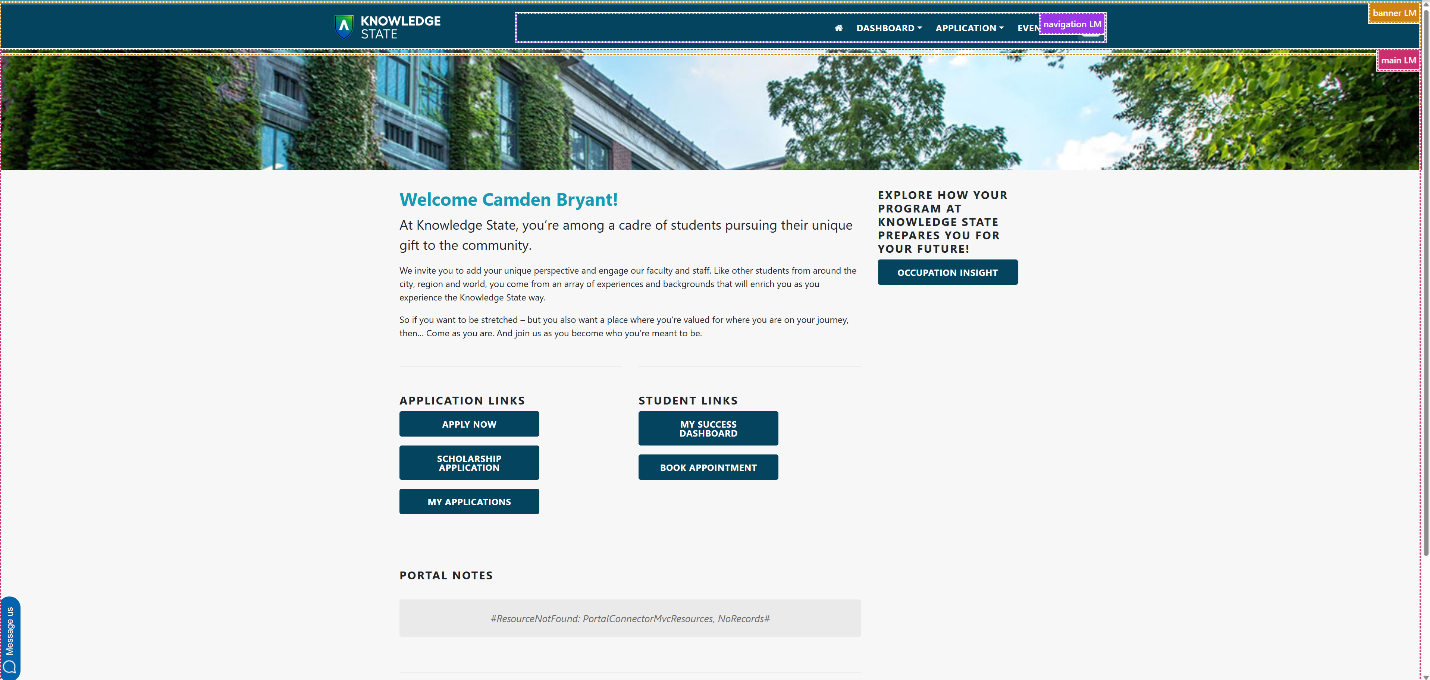
Pages in Reach follow a standard visual layout to ensure familiarity as users navigate through the platform. The application is structured logically by headings and landmarks. This gives users the ability to quickly understand the structure of any page in the application and easily move to the appropriate section of the page or content item.
Structure by Headings
-
If H1 headings are present it signifies the current page a user is on.
-
H2 headings are used to delineate major sections of a page.
-
H3 Headings are used for informational purposes
Structure by Regions (Landmarks)
Reach has defined sections on each page using HTML and ARIA Regions/Landmarks that allow users of assistive technologies to navigate the page more efficiently. With Regions/Landmarks, users can quickly understand the structure of any page in the application and easily move to the appropriate section of the page.
Regions/Landmarks in Reach include:
-
Banner
-
Navigation
-
-
Main
-
Content Information
Keyboard Navigation
Reach's product team works continuously to implement operable features using the industry standard keyboard interactions. We consider the requirements for each component so users can perceive and operate the functionality correctly.
Keyboard navigation patterns differ between browsers (Microsoft Edge, Firefox, Safari, Chrome), but the interactions within any particular browser are common and consistent.
Skip to Main Content
Across the platform is a skip link, which can be used as a mechanism to bypass blocks of content that are repeated on multiple pages. This allows users to jump directly to the main content area. Keyboard-only and screen reader users can avoid repeated content and navigate faster through the page. Users can tab until the keyboard focuses on the "Skip to main content" link that goes directly to the main body of content.
Focus Order
Users can navigate the application sequentially using the keyboard. Interactive elements receive focus in the order content is visually arranged, preserving meaning and operability.
Visual Presentation and Multimedia Content
-
The visual presentation of text, graphic elements, and user interface components and states offer appropriate color contrast.
-
Users are able to define alternative text for images uploaded through the course content, course banner, or content editor.
-
Buttons in the interface have an accessible name or label allowing assistive technology users to perceive the purpose of the element.
Assistive Technology Compatibility
For the best experience with screen readers, we recommend these combinations:
| Screen reader | Operating System | Browser |
|---|---|---|
| JAWS | Windows | Firefox / Google Chrome |
| NVDA | Windows | Firefox / Google Chrome |
| VOICEOVER | MAC OS | Safari / Firefox / Google Chrome |
Navigate the Gradable Items tab in the Gradebook
The Gradable Items tab uses a table-based layout to enhance usability for keyboards and screen readers.
Feedback
We welcome your feedback on accessibility for people with disabilities and those who use assistive technology with our products. We encourage you to contact us with any questions or concerns at accessibility@anthology.com. Please note that this email address is solely used to respond to questions about the use of assistive technologies with Anthology's products.